November 22, 2010

Outline text or fonts in Illustrator

In Illustrator fonts remain editable text by default. You can change the text, delete the text or kern it. If you so desire, you can convert your text to outlines. By doing so you can then manipulate the text curves and paths. However, once you converted to outlines, it is no longer editable with the text tool.

Here is how to convert your text to outlines:

1) Draw a text box and type your word, phrase, sentence, paragraph, etc. Here is my sample text. Notice the thin blue line directly under the baseline of the text. This is Illustrators way of indicating editable text with the text tool.


2) With your text selected, go to Type > Create Outlines.


3) Notice that your text is now outlined. There is no thin line under the text and all the individual anchor points for the characters are visible.


Once you convert your text to outlines, you may not undo. There is no "convert to text" option in Illustrator. I recommend finalizing your layout and text and only convert to outlines at the end. You can also make a duplicate of your text(simply copy and paste), so if you need to make an edit, you still have the original text.

Here is Adobes tutorial for CS3, CS4, CS5

November 9, 2010

Ikea Cookbook


Ikea makes some wonderful home furnishings. I came across a cook book from Ikea portraying the ingredients as well as the finished product. It isn't often that cookbooks display the raw ingredients, especially in this manner. In fact, I enjoy looking at the triangles of sugar, cubes of butter, and crumbling blocks of flour more than the tasty desert they will become.

Check out more of the products, both before and after:

The person who finds the egg timer in their cracker wins!


Would you like some cookie with your butter?

http://demo.fb.se/e/ikea/homemade_is_best/

October 12, 2010

Indesign Layer Visibility Override

Objects that are place into InDesign may loose some of their visibility settings when placed into an InDesign document. The example I encountered was an Illustrator file which was comprised of 3 layers. I had intentionally turned off the top layer before saving and placing it into InDesign. However, the layer was turned on during the import and I could see the unwanted layer.

The fix lies within InDesign. On the Links Panel you will see listed the links in your document. All my links are linked, however one has an eye icon next to it. On mouseover the icon reads "Object has layer visibility override".


1) On your canvas, select your placed object, and right click on it. Select "Object Layer Options..."


2) You will see the layers that make up the original file. In my example, I have a Illustrator file with 3 layers. All 3 layers are visible, but I only want the bottom 2 layers to be seen. To turn this top layer off, click the eye in front of the layer you do not want to be visible. I circled that layer in the image below.


3) Now the bottom 2 layers are visible, and the top layer is not. The object will display correctly in InDesign.


NOTE:
Turning these layers on and off in InDesign does NOT affect the layer visibility within Illustrator. Once you open the original Illustrator file, your layers will remain the same way you saved them in Illustrator. This InDesign tutorial only changes how it displays within InDesign.

October 9, 2010

Pecha Kucha Pittsburgh

Pecha Kucha, or PKN for short is a fast paced forum for artists. The format allows for 20 slides, and the speaker gets 20 seconds per slide. The audience may heckle the presenter, interjecting their opinions; praises, or arguments. The Pittsburgh forum is sponsored by the AIA and AIGA every 4 months, rotating venues throughout the city. You can see some examples of past Pittsburgh PKN events here.

This past week I presented for the first time at a PKN night. I presented a talk on leadership entitled "How to Get People to Do What You Want and Have Them Enjoy Doing It (A Crash Course in Leadership)". The topic is broad enough for the architects, graphic designers, and guests to all relate to. In the past, I found that talks on a specific concepts specialized to a persons field was a little too technical for the general audience. The talks I enjoyed the most were the ones which discussed broad topics, and probed questions; where the audience was engaged or thinking deeply about the idea.

I wanted my talk to be encouraging and entertaining. I researched many leaders, their styles, and juxtaposed some controversial and well-loved popular leaders. My audience wasn't stiff upper-management of a large company - they were my peers. I wanted it to be for the everyday person and how leadership plays a role in their day to day activities. At almost every interaction, there is a leader and follower. When in a group of friends it may be less obvious, but still a gathering at a local bar had to be organized by someone.

After the talk, several people asked me "What do you do? Do you teach this or do leadership training?" I'm a graphic designer - junior level, and no I do not teach this. I volunteer with local organizations often leading events, but it's a hobby, not paid career.

I have always enjoyed observing group dynamics. I became aware how people adopted(or were assigned) different roles and how successful or how unsuccessful their tasks were. Although I do not have a career specifying in leadership training, I believe that everyone can benefit from understanding the roles of a good leader and followers. After all, getting people to do what you want and have them enjoy doing it is no easy task. It's an art form.

September 28, 2010

Custom Photoshop Brushes


I found a tutorial for how to make your own Photoshop brushes. It allows you to make your own unique, customized brushes.

I tried the tutorial and found a few modifications you can make to the brushes.
Follow the first 5 steps of the tutorial:
1-4) Create a mark, design, or stroke.
Instead of using a brush and paint,I drew a design with a pencil.
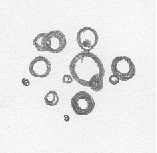
Here's what my design looks like.

5) Scan the images into Photoshop and save as high resolution PSD's.

In my image the the color of the paper did not scan in as pure white.
I want to eliminate some of the grey background so that it doesn't show up on my brush. I created a step 5a to make the background white and the design darker.

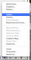
5a)Adjust the levels of the drawing to increased the contrast. My preferred method is to go the the layers palette and create a new "Levels" layer.
Check the box that says "Preview" so you can see what your image will look like. Adjust the Levels sliders - the positioning of the level controls will probably look similar to the image below.


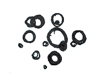
Now the grey background is gone and I'm left with only the circles.

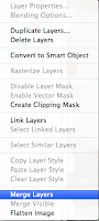
On your Layers Palette select the layer that contains your artwork and the layer that has the adjustment levels. Right click on the either layer name and select "Merge Layers".

6) Select your new layer and go Edit > Define Brush Preset. Save your brush. It will now appear in your brush palette.
To change the appearance of your new brush, go to your brush palette. If your brush palette is not visible go to Window > Brushes.


With this palette you can change the brush size, opacity, rotation, etc. Experiment and see what kinds of effects you can get!